ISCA New Logo Process
 | |
| Author | Beau Hufford |
|---|---|
| Genre | How-To |
| Published | EF Issue 2015.2 |
Publication date | Spring 2015 |
| Media type | Digital |
| Pages | 9-11 |
| Website |
|
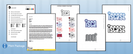
The ISCA and EF design process described by Beau Hufford on pages 9-11 of the digitally release Spring 2015 EF.
Article Transcript
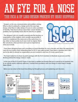
Design is, at its core, communication and problem solving. When a client is asking for a design and in this case logo design, what they’re really asking is for you to solve a problem of identity. That doesn’t always mean their current identity is a problem, but it probably means that it’s time for an update. The designer’s job is to visually communicate the business or organization in the simplest, most versatile way possible. It needs to complement the name and, at the same time, in a day when we have pretty much seen it all, be original. Much like caricatures, what you leave out is just as important as what you include.
I have been designing logos and consulting on brand identities for over a decade, and when the opportunity came for me to pitch some rebranding ideas to ISCA I was really excited. I have been a member since 2003, and to be able to rebrand an organization you are invested in and love, it’s truly a great honor. The board asked me to share my pitch package with the ISCA members to illustrate my process and the thinking behind the design choices I made. In the case of the ISCA and EF logos, it was time to update two brands that are so special to its members but, to an outside world, relatively unknown. I tackled these problems with two things in mind: Keep It Simple. Make It Bold.
Below are my notes to the board describing my thought process and explaining each decision. The purpose of this rebranding package is to serve the International Society of Caricature Artists with a fresh, relevant approach on their creative brand. It is a typographical logo meant to be a clear representation of the letters I,S,C, and A as well as suggest three key associated messages:
- We are artists.
- Our members are from around the world.
- Our society is focused on caricature and cartoon.
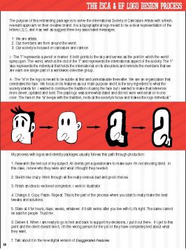
I - The “i” represents a pencil or marker. It both points to the sky and serves as the point in which the world spins upon. The world, which is the dot of the “i” and represents the international aspect of the society. The “i” also represents the individual that holds the international on its shoulders and reminds the members that we are each one single part of a worldwide collective group.
A - The “a” in the logo is meant to be subtle at first and unmistakable thereafter. We are an organization that celebrates the face. We focus on its features as our main purpose and it is the key ingredient to what the society stands for. I wanted to continue the tradition of using the face but I wanted to make that reference more clever, updated and bold. The past logo was somewhat dated and did not work well small or in one color. The face in the “a” keeps with the tradition, nods at the society’s focus and makes the logo individual.“
My process with logos and identity packages usually follows this path through production:
- Research the hell out of my subject. All clients get a questionaire to make sure I’m not shooting blind. In this case, I knew who they were and what I thought they needed.
- Sketch like crazy. Work through all the really obvious bad and good choices.
- Finish an idea to vectored completion. I work in Illustrator.
- Change it. Copy. Paste. Repeat. This is the part of the process where you start to really make the best tweaks and solutions.
- Stare at it for hours, days, weeks, whatever. If it still works after you live with it, it’s right. The same cannot
be said for people. Trust me.
- Deliver it. When I am ready to go to hell and back to support my decisions, I put it out there. If I get to this point and the client doesnt like it, I’m the wrong person for the job or they have completely lied about what they want.
- Talk about it in the new digital version of Exaggerated Features.
Tagline, You're It!
A WORLD DRAWN TOGETHER
I started to think about a tagline that met the needs of the organization and made sense to people not only
who knew what we did, but spoke to someone who had no clue what ISCA meant. When I think about the
people in the ISCA, I think about a massive amount of talent from all over. People who travel both physically
and mentally from a place to join each other through a common art form, be it on the Internet or mini-cons
or the main convention. Each person is brought together by the love of caricature. We can’t help but be
drawn to the convention, to its members and to an ideology that connects us for the rest of our lives. We
draw together. We are drawn together. We are the world. OK, that last one is not mine, but you get the idea.
What the EF?
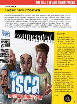
After I delivered the ISCA
logo to Nolan and the team,
they asked if I had any ideas
for the EF cover logo as well.
My main thoughts were that
it could be simplified, placed
in one color and be prepared
for color variations depending
on the issues’ topics. I
don’t think it needs to be
wacky or have an extremely
strong presence. It needs to
be legible and let the
content and cover art be the
commanding force.
Thank you!
I am extremely honored to
have had the opportunity to
design for the ISCA brand. I
hope the new identity does the
job it was meant to do by
creating a whole new era of an
organization that brings the
world’s greatest talents together.
I’m better for it, and I can’t
imagine a world without this
amazing life-changing brand!
-Beau
See Also
External Links
This Navigation box may not show up on mobile browsers. Please see Exaggerated Features Issue 2015.2 for the full contents of this issue if the navigation box does not display.


